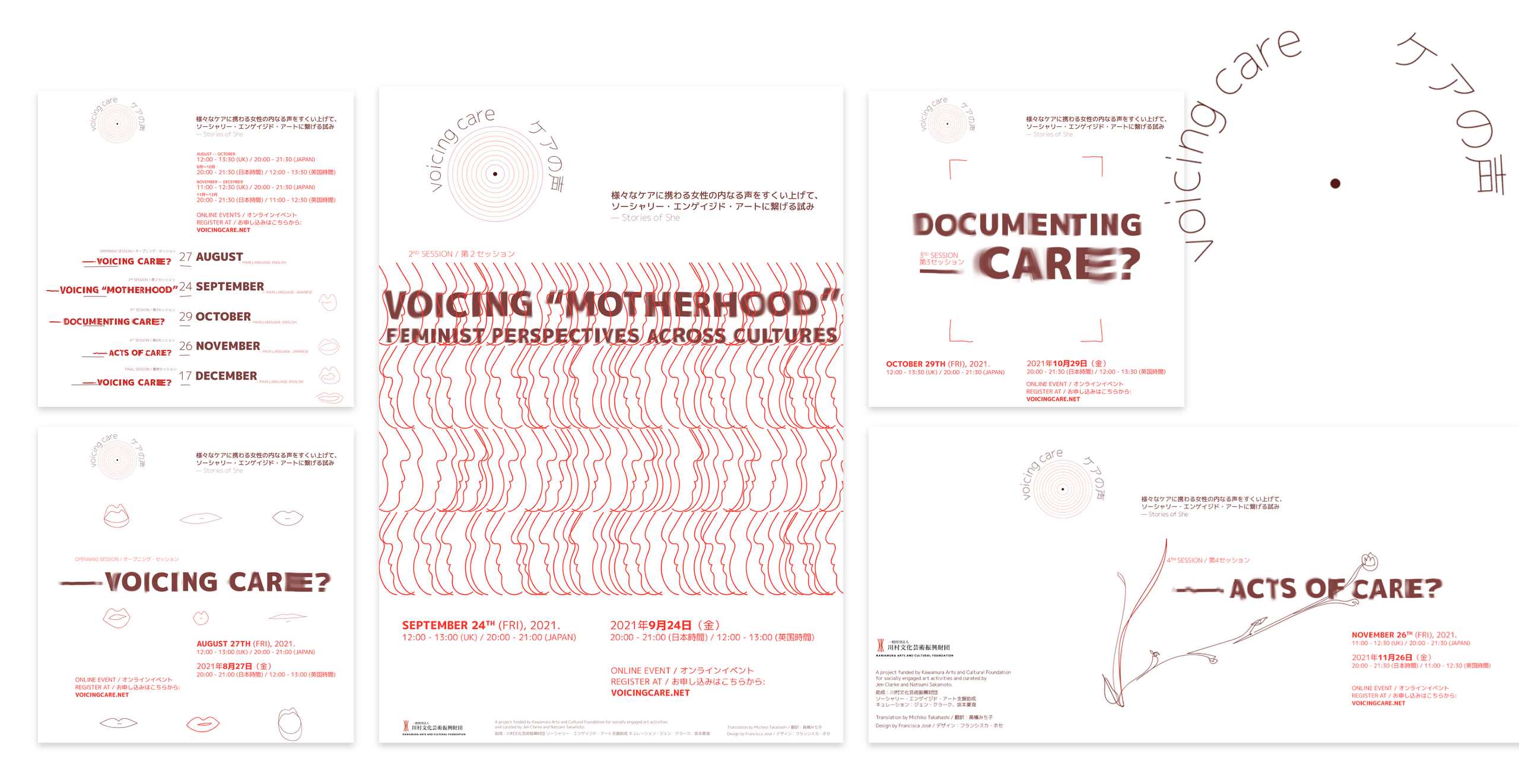
About the Voicing Care design
Voicing Care has been a challenging project and very much cared for.
Designing its identity was a very rewarding process because I learned a lot, especially about Japan, both language and ways.
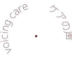
The circular shape was chosen to represent inclusion and sound. We want this project to be a safe space in which to voice opinions and concerns. It also resembles a bit a woman’s breast, it was on purpose.
The moving text is an analogy to its trans-national, open and dynamic nature. In the static version of the logo, was important for us to avoid any verticality. The color palette is warm and earth based and the illustrations outlined and transparent.
I would like to show you our website. Although this is the final zoom session, we will keep this conversation open and continue to accept suggestions and contributions.
I’d like to speak of three special pages:
. Glossary: is a never-ending-work-in-progress. We posted some key concepts and are always interested in other perspectives.
. Archive: is where we write about the ideas we’ve been exploring.
. Voices: is an open space for anyone who wants to share.
「ケアの声」はやりがいのあるプロジェクトで、とても大切に考えてきました。そのアイデンティティをデザインすることは、とてもやりがいのあるプロセスでした。とういうのは、特に日本について、言葉も慣習も含めて多くを学ぶことができたからです。
円形の形は、「多様性の受け入れ」と「音」を表すために選びました。このプロジェクトが、意見や懸念を表明できる安全な空間であってほしいのです。また、この形は、少し女性の胸に似ていますが、これは意図的なものです。
動くテキストは、国を超えた、オープンでダイナミックな性格を類推させるものです。静止画のロゴでは、垂直性を排除することが重要でした。カラーパレットは温かみのあるアースカラーで、イラストは輪郭がはっきりした透明感のあるものです。
私たちのウェブサイトをお見せしたいと思います。今回は最後のズームセッションですが、私たちはこの会話をオープンにして、引き続き提案や投稿を受け付けています。
3つの特別なページについてお話したいと思います。一つ目は、用語集:これは終わりのない進行中の作業です。重要な概念を掲載しましたが、他の視点からの意見にも常に関心を持っています。二つ目は、アーカイブ:私たちが探求してきたアイデアについて書き記す場所です。三つ目は、様々な声:それぞれの意見を共有したい人のためのオープンスペースです。
